Candlestick Charts and Patterns
Candlestick charts are perhaps the most popular trading chart. With a wealth of data hidden within each candle, the patterns form the basis for many a trade or trading strategy.
Here we explain the candlestick and each element of the candle itself. Then we explain common candlestick patterns like the doji, hammer and gravestone.
Beyond that, we explore some of the strategy, and chart analysis with short tutorials.
Reading candlestick charts provides a solid foundation for technical analysis and winning binary options strategy.
Japanese Candlestick Charts Explained
Japanese Candlesticks are one of the most widely used chart types. The charts show a lot of information, and do so in a highly visual way, making it easy for traders to see potential trading signals or trends and perform analysis with greater speed.
So let us explain what Japanese Candlesticks are, how the “candles” are created and basic candlestick interpretation.
It’s a fact that many novice traders, new to the trading industry, focus on candlesticks because they are easy to understand and give a feeling of real trading to someone. But it’s also a fact that nobody made money only using candlestick patterns.
Many new traders are excited because they have some good results in the beginning by candlestick patterns without spending much time reading about trading, but in the long run they fail and they come back to learn more.
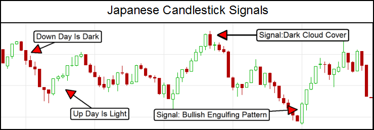
Candlestick patterns are a good tool, but only for confirmation. Of course every trader should know how to read the candles.
I believe this is “Lesson #1” for the new traders. If you know how to read the candles properly, you can use them for confirmation in your trades – but first you must know the basics
Candlestick Patterns
Japanese Candlesticks are a type of chart which shows the high, low, open and close of an assets price, as well as quickly showing whether the asset finished higher or lower over a specific period, by creating an easy to read, simple, interpretation of the market.
Candlesticks can be used for all time frames – from a 1 minute chart right up to weekly and yearly charts, and have a long and rich history dating back to the feudal rice markets of ancient Samurai dominated Japan.
When information is presented in such a way, it makes it relatively easy – compared to other forms of charts – to perform analysis and spot trade signals.
What Each Candle Tells Us
To understand how this works, we’ll need to look at how each bar is constructed. As indicated, each candle provides information on the open, close, high and low of an assets price. Each reflects the time period you have selected for your chart.
For example, if a 5 minute chart was used each candle shows the open, close, high and low price information for a 5 minute period. When 5 minutes has elapsed a new 5 minute candle starts.
The same process occurs whether you use a 1 minute chart or a weekly chart. The open and close are marked by the “fat” part of the candlestick.
This is called the real body, and represents the difference between the open and close.
If the close is higher than the open, the candle will be green or white; if the close is lower than open the bar will be red or black but other colors can often be found on different charts.
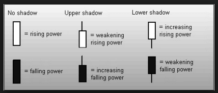
The open or close are not necessarily the high or low price points of the period though. The high and low prices for the period are marked by a “wick” or “upper shadow” and “lower shadow.”
The high point of the upper shadow gives the highest price the asset went during that period, and the low point of the lower shadow gives the lowest price the asset went during that period.
Doji
If there are no upper or lower shadow it means the open and close were also the high and low for that period which in itself is a kind of signal of market strength and direction.
Occasionally you will also see bars that are nearly all upper and/or lower shadow, with very little real body. These are called dojis and have special meaning, a market in balance, and often give strong signals.
Strategy Basics
Due to the highly visual construction of candlesticks there are many signals and patterns which traders use for analysis and to establish trades. Some patterns will be classed as ‘advanced strategies’, but there are general principles that those new to Japanese Candlestick charts should understand. Here are a few, I’ll go into more detail on some of these ideas further along in this discussion.
- A long real body indicates stronger pressure than a small real body. For example, a long green body represents stronger buying pressure than a small green body. A long red body represents stronger selling pressure than a small red body.
- Shadows can be used to determine what group of traders–buyers or sellers–was strongest at the close of a candle. While not always, it is quite possible that the strongest group at the close of the prior bar will be strongest heading into the next bar.
- A long lower shadow with very little upper shadow indicates sellers tried to push the price down, but ultimately the buyers succeeded in pushing the price back up and were strong at the close.
- A long upper shadow with very little lower shadow indicates buyers tried to push the price up, but ultimately the sellers succeeded in pushing the price back down and were strong at the close.
Interpreting Tails
What many traders fail to pay attention to is the tails or wicks of a candle. They mark the highs and lows in price which occurred over the price period, and show where the price closed in relation to the high and low.
During an average day of trading upper and lower shadows are commonly formed, and they don’t really mean that much. But on some days, as when the price is trading near support or resistance levels, or along a trend line, or during a news event, a strong shadow may form and create a trading signal of real importance.
If there is one thing that everyone should remember about the candle wicks, shadows and tails is that they are fantastic indications of support, resistance and potential turning points in the market.
To illustrate this point lets look at two very specific candle signals that incorporate long upper or lower shadows.
The Hammer
The hammer is a candle that has a long lower tail and a small body near the top of the candle. It shows that during that period (whether 1 minute, 5 minute or daily candlesticks) that price opened and fell quite a distance, but rallied back to close near (above or below) the open. This is sign that buyers stepped into a weak market and are “hammering out a bottom.”
Long lower tails are seen all over the place, and aren’t significant on their own. But they are significant when a long lower tail–hammer–is seen near support. It indicates the sellers tried to push the price through support but failed, and now the buyers are likely to take price higher again. The thing to remember here is that a hammer could indicate a new area of support as well.
Figure 1 shows an example of a hammer candle on the USDJPY Daily Chart.
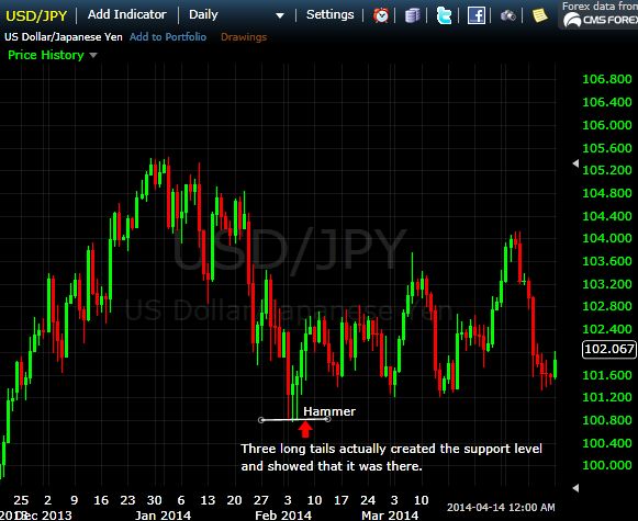
Three candles, all with long tails occurred in the same price area and had very similar price lows. That three long tailed candles all respected the same area showed there was strong support at 100.800.
When the hammer occurred (third candle in the series with the red area below it) it showed that price was likely to continue higher, since sellers had tried to push the price lower, but couldn’t.
The Gravestone
The gravestone (or ‘tombstone’) is a candle that has a long upper tail and a small body near the bottom of the candle, opposite of the hammer.
It shows that during the period (whether 1 minute, 5 minute or daily candlesticks) that price opened then rallied quite a distance, but then fell to close near (above or below) the open. This is sign that sellers stepped into a hot market and created a graveyard for the buyers.
Long upper tails are seen all over the place, and are not significant on their own. But they are significant when a long upper tail–gravestone–is seen near resistance, unless of course a new resistance level is being set. It indicates the buyers tried to push the price through resistance but failed, and now the sellers are likely to take price lower again.
Figure 2 shows an example of a gravestone candle on the EURUSD hourly chart.
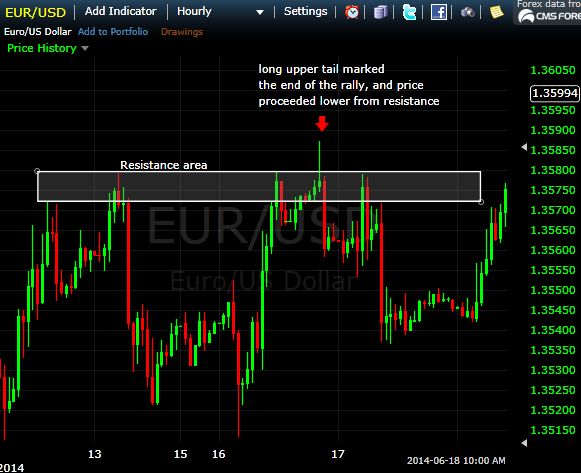
The price tested this resistance area multiple times, finally it broke above it, but within the same bar (one hour) the price collapsed back. This indicated the buyers didn’t have control and that the breakout would likely fail. The price did proceed lower from there.
Tails, Wicks And Shadows
Look for them on candles, they are important. Multiple long tails in one area, like in figure 1, show there is a support or resistance there. If a hammer or gravestone candle occurs near support or resistance, expect a reversal since the support/resistance has held.
A hammer opens and closes near the top of the candle, and has a long lower tail. A gravestone opens and closes near the bottom of the candle, and has a long upper tail.
By themselves they can give shady signals so beware, when used with other analysis like support/resistance, stochastic, MACD, trend line etc are a very powerful tool of the modern trader.
The next thing to look out for is the doji, a candle that combines traits of the hammer and gravestone into one powerful signal.
Doji Strategy for Binary Options
Dojis are among the most powerful candlestick signals, if you are not using them you should be. Candlesticks are by far the best method of charting for binary options and of the many signals derived from candlestick charting dojis are among the most popular and easy to spot.
There are several types of dojis to be aware of but they all share a few common traits. First, they are candles with little to no visible body, that is, the open and closing price of that sessions trading are equal or very, very close together.
Dojis also tend to have pronounced shadows, either upper or lower or both. These traits combine to give deep insight into the market and can show times of balance as well as extremes. In terms of signals they are pretty accurate at pinpointing market reversals, provided you read them correctly.
Like all signals, doji candles can appear at any time for just about any reason. All they really signify is a balance of today’s traders; if buyers and sellers are in balance during a session price action will remain stable.
It takes other factors to give the doji true importance such as volume, size and position relative to technical price levels. Truly important dojis are rarer than most candle signals but also more reliable to trade on. Here are some things to consider.
First, how big is the doji. If it is relatively small, as in it has short upper and lower shadows, it may be nothing more than a spinning top style candle and representative of a drifting market and one without direction.
If however the doji shadows encompass a range larger than normal the strength of the signal increases, and increases relative to the size of the doji. Candles with extremely large shadows are called long legged dojis and are the strongest of all doji signals.
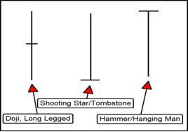
Second is where the doji appears; does it appear at a support or resistance line or is it floating in a no man’s land between two support/resistance targets. If it is not near a support/resistance line the signal is much weaker than if it is confirming a support or resistance.
In fact, if the shadow, either upper or lower, crosses one of these lines and then closes above/below it the signal is quite strong indeed.
One of this type appearing at support may be a shooting star, pin bar or hanging man signal; one occurring at support may be a tombstone or a hammer signal. Look at the example below. There are numerous candles that fit the basic definition of a doji but only one stands out as a valid signal. This doji is long legged, appears at support and closes above that support level.
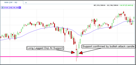
Another confirming indication that a doji is a strong signal and not a fake one is volume. The higher the volume the better as it is an indication of market commitment.
In respect to the above example it means that price has corrected to an extreme, and at that extreme buyers stepped in. It also means that near term sellers have disappeared, or all those who wanted to sell are now out of the market, leaving the road clear for bullish price action.
Doji’s can be trend following or indicate reversals so that must be considered as well. A doji confirming support during a clear uptrend is a trend following signal while one occurring at a peak during the same trend may indicate a correction.
The same is true for down trends. Failing to account for trend, or range bound conditions, can be the difference between a profitable entry or not.
Doji Patterns – Conclusions
While doji’s can be fantastic signals for binary options they should be considered a signal to look for entry, and not as an entry itself. In the example above a call option is clearly the correct thing to do but if purchased at the close of the doji, it could easily have resulted in a loss.
The doji shows support like sonar shows the bottom of the ocean but that does not mean a reversal will happen immediately. The best thing to do is to wait for at least the next candle and target an entry close to support. This same is true for resistance as well.
Doji’s are also fine to use in any time frame but remember the rules. When changing time frames add this; the doji’s size and analysis is relative to other doji’s and candles in that time frame. A long legged doji doesn’t mean the same thing if they appear frequently on the charts unless it is significantly larger the average long legged doji.
Expiry will be your final concern. If entry is taken very close to the targeted support/resistance level a one or two bar expiry is most likely all you will need but it may be prudent to extend that out to 5 bars just to make sure.
Chart Patterns Explained
Have you ever heard the saying, “can’t see the forest for the trees”? This is a very apt saying that simply means getting caught up in the small things and not seeing the bigger picture.
This can happen all to often when trading and is especially common among newer traders. It can happen in a number of ways such as too many indicators, paying too much attention to minor day to day fluctuations or in the case of today’s discussion, paying to much attention to your Japanese Candlesticks.
Candlesticks, and candlestick charting, are one of the top methods of analyzing financial charts but like all indicators can provide just as many bad or false signals as it does good ones. For that reason alone it is a good idea to filter any candle signal with some other indicator or analysis.
I’m going to assume that you already know something about candles because you are this deep into the article already.
I like them because they offer so much more insight into price action. Switching from a line chart to an O-H-L-C chart to a candlestick chart is like bringing the market into focus.
The candles jump off the chart and scream things like Doji, Harami and other basic price patterns that can alter the course of the market. The thing is, these patterns can happen everyday.
Which ones are the ones you want to use for your signals? That is the question on the mind of any one who has tried and failed to trade with this technique.
Candlestick Analysis – Examples
Look at the chart below; a new candle forms every day. Some day a bullish candle, some days a bearish one, some times two or more days combine to form a larger pattern. Not all of them result in the “expected” movement. Look at the chart below. I have marked 8 candle patterns widely used by traders that failed to perform as expected.
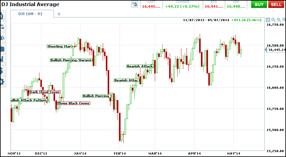
Why is this you may ask yourself?
It all comes down to where the signals occur relative to past price action. When I start to add other indicators to the charts it may become clearer.
The first and foremost reason is that the candle patterns I have marked do not take any other technical or fundamental factors into account.
I know that as binary traders we do not use much fundamental analysis but any trader worth his salt has at least a minor grip on the underlying market conditions. After that some simple additions to the chart can help to give some perspective and allow you to see the forest, and not just the trees.
Time frame is one important factor when analyzing candlesticks. The very first thing I like to do is to literally take a step back from my standard chart for a better view of the market.
I use charts of daily prices with 6 months or one year of data. To get the broadest view I can I use a chart with 5 or 10 years of data. The 5 year chart is where I draw support, resistance and trend lines that will have the most importance in my later analysis.
Having an idea of where price action, and the candlesticks, are in relation to the long term trend and areas of support/resistance is crucial to interpretation.
A candle signal occurring at or near a long term line is of far more value than one that is near a shorter term line. You can use weekly bars or daily, it doesn’t matter, but sometimes a really strong candle signal will appear on the weekly charts too.
Moving Averages
Moving averages are another good way to help weed out bad candlestick signals. There are many types of moving averages but I like to use the exponential moving average because it tracks prices more closely than the simple moving average.
I use the 30 bar and 150 bar moving averages but you can use any duration that works for you. The point is to use the EMA’s to help confirm or deny potential candle signals.
In theory, each moving average represents a group of traders; the 30 day EMA short term traders and the 150 day EMA longer term traders.
A candlestick signal that fires along the moving averages is a sign that that group of traders is behind the move.
A signal along the 30 bar EMA would not be as strong as a signal along the 150 bar EMA while a signal that fired while the two EMA’s were tracking alongside each other would be the strongest of all.
Volume
Volume is a third factor that I like to take into consideration when analyzing candle charts. Volume is one of the most important drivers of an assets price.
The more people that want to buy an asset the higher and quicker prices will move up. The more people that want to sell an asset the lower and quicker prices will drop.
This can also be applied to candlesticks, the more volume during a given candle signal the more important of a signal it will be.
Further, if volume rises on the second or third day of a signal that is additional sign that the signal is a good one.
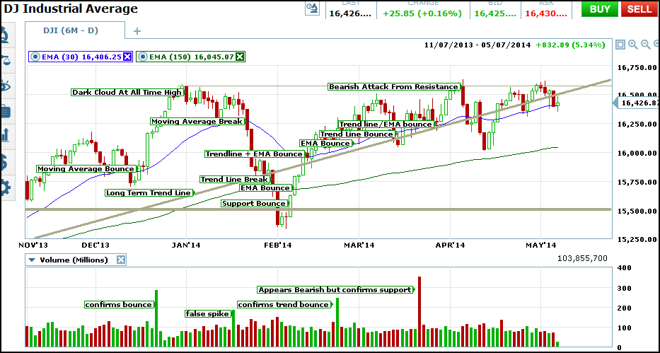
Take a look at the chart below. I have redrawn support, resistance, trend lines and moving averages.
Then I looked for candle signals along those lines and correlated volume spike to them. Using the additional analysis techniques the 8 losses on the chart above could have been avoided and instead been turned into these dozen or so winning trades.
The volume does not spike on every signal but there are a few significant spikes to see.
Reading Charts – Closing Guide
There are many candlestick patterns for you to explore if you enjoy this type of “visual” trading style, I’ve barely scratched the surface. Candlestick patterns are useful for both short and long-term trades as these patterns occur on one minute charts right up to weekly charts (or longer).
Looking at a chart you’ll see lots of patterns, the key is to understand which ones are really signals and which ones are just random market movements. Be selective, and only trade when there are confirming factors and indicators.
Use other technical analysis methods to validate all patterns. For example, a bullish engulfing pattern that occurs at a support level is more likely to work out than if a bullish engulfing pattern occurs on its own
Demo Accounts can be solid way to toy with candlestick analysis and find a strategy.