Find the Best Trades by Comparing Multiple Symbols on One Chart
You’re trying to juggling watching multiple charts and you find you are missing trades because there is too much going on. Or maybe you are watching several assets but only want to buy the strongest or sell the weakest. In either case, to make life easier, you can watch multiple assets on one chart using a comparison tool.
A comparison tool is a great way to monitor multiple assets at one time. If you are watching for relative strength or weakness it can be a major help.
How to Compare Multiple Symbols
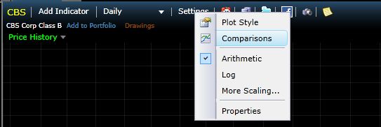
Freestockcharts.com provides a tool for comparing up to 6 assets. Just hit Settings and then select Comparisons.

Source: all figures from www.freestockcharts.com
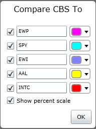
A window pops up and you can input up to 5 symbols which will be plotted against the stock or asset you already have on the chart (in this case, CBS). Change the colors on each asset so you can differentiate between them. Also, if you want to see how each stock/asset is performing over time, put a check market beside “Show percentage scale.”

Bam! You have a super quick way of comparing multiple stocks/assets and seeing which are performing well or poorly compared to the others.

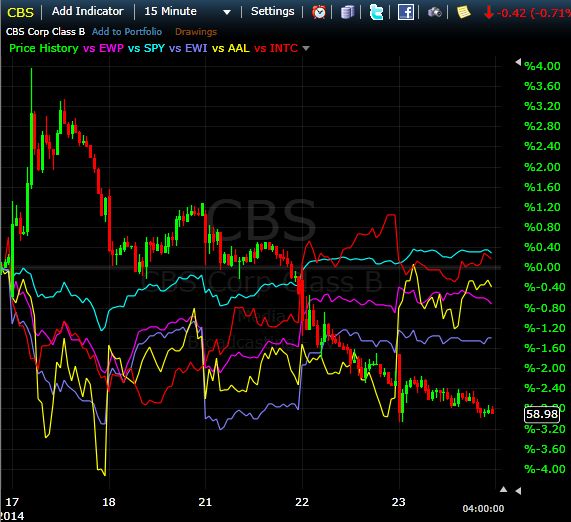
This chart shows several trading days on a 15-minute time frame. CBS is the candlestick chart, and all the other lines represent other stocks or ETFs (legend is posted along top of chart).
From the chart we can see CBS started out very strong (left of chart) but is now one of the weakest stocks of the group. SPY has been the steadiest, is slowly rising and is the most steady.
AAL has been volatile, and started out weak but has rebounded strongly recently.
For day trading and swing trading, if I am going long I typically want to be in the strongest assets during uptrends, and shorting the weakest assets during down trending period.
Assume you are going to trade sector ETFs. Place a number of stock sector ETFs you are interested in trading on the chart. You can then quickly see which are strongest and which are weakest. Since a strong sector can become a weak sector, and vice versa, by plotting them all on the same chart you can act quickly when this occurs.

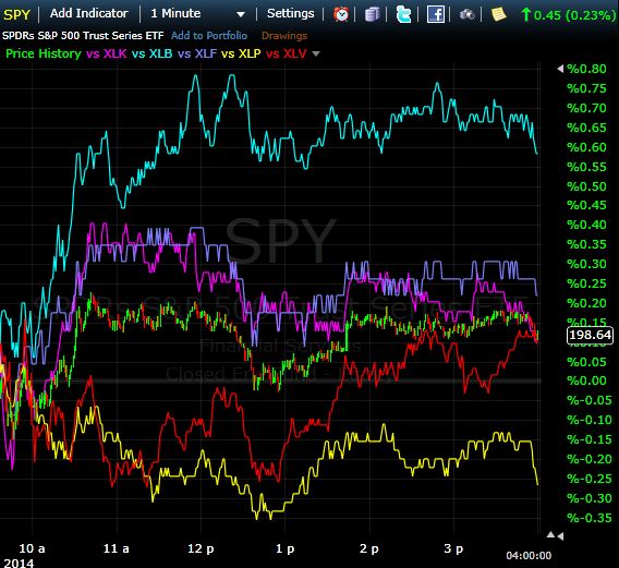
The above chart is intra-day (1-minute) shows the S&P 500 being compared to a number stock sector ETFs. XLB stands out in the morning; if you wanted to be long that was the one to be in. During the afternoon it ranged though. In fact, after 1 PM we see ranging action in most of the sectors and the S&P 500. One exception is XLV, which had a nice overall uptrend through the afternoon. This would have been one of the better to places to be (out of these assets) in the afternoon.
Other Uses and Final Word
You can also use comparison charts to see if assets are correlated with each, i.e. if they move together.
Once you start using comparison charts you likely won’t stop, since they are an easy way to spot weakness and strength and decide where the best trading opportunities lie.
Play around with it, get used to the functionality and then see if you can incorporate the knowledge you attain into your trading.
Cory Mitchell @corymitc